
Your Custom Text Here
Picking Your Perfect Pattern
When it comes to interior design, colors and textures are everything! Because there are so many different prints and patterns to choose from, we know that finding what works can sometimes be more frustrating than fun. So, what are the tricks of picking the perfect pattern for your space? Whether you choose stripe, floral, houndstooth, buffalo check, animal print, or motif, it's ultimately up to you and your style.
To help you feel less stressed, we decided to share some of our favorite ways to incorporate prints and patterns that will keep your next design project looking fresh and feeling balanced!

Photo courtesy Hymns and Verses
One of the more trendy patterns out there right now is the classic buffalo check, and we can see why! This darling pattern is the perfect accent to any room, and it pairs well with other prints too. It can obviously be found in a variety of colors, but we are really loving the neutrality of the black and white version with these fun bright pink floral pillows.

Photo courtesy www.lushome.com
Stripes are one pattern we can guarantee will never go out of style! Too many stripes can overwhelm a space, so we suggest using them in moderation. This sweet and cozy daybed with white linens and throw pillows in various stripe sizes is the perfect combination in our book. And not to mention, the coordinating striped rug really brings it all together!

Photo courtesy Ali Express
Florals are always a favorite, and whether you choose floral bedding, artwork, drapes, or throw pillows, you can't go wrong! Big and bold floral prints are typically better suited for large spaces, and smaller, more delicate patterns for small spaces. However, if you are looking to make a statement, bring in the large print no matter what size space it's going in!

Photo courtesy Interiorholic
Houndstooth always seems to give off a more traditional vibe and is definitely another classic print, but one that can be used in a variety of ways. The scale of the pattern can be small or large, and both are perfect when used for accent pieces like this gorgeous chair. Keep in mind that if you are looking for a more neutral tone, stick to the smaller scale print. If you are looking for bright and beautiful, try a larger scale print.

Photo courtesy Beautiful Habitat
Finally, if you are feeling adventurous, try mixing your favorite patterns! This room is bright and bold, and the perfect example of total balance when it comes to mixing patterns. Pairing a floral chair and drapes with, geometric walls and animal print may sound like a disaster, but it looks stunning together when coordinating or complimentary colors are used.
Now, what pattern or print are you always drawn too? We shared our favorites, now you share yours and comment below!
French Revival Project: Time for the Turrets
What exactly is a turret? Simply put, a turret is a small tower that projects from a building or structure. We know you are probably thinking "Do they mean a castle?" The answer is yes! Turrets were originally used on medieval castles to provide the inhabitants with a good defensive position should the need arise. As military defenses became less necessary, turrets were created for decorative purposes like the ones we see on homes today.
Our French Revival Project has several turrets in various sizes, but today we thought we'd share about the largest one and how it all came together.
We love all the curves and arches that are interspersed throughout the home, but just beyond this amazing covered front entrance is one of our favorite details—a turret that is both commanding and lovely.
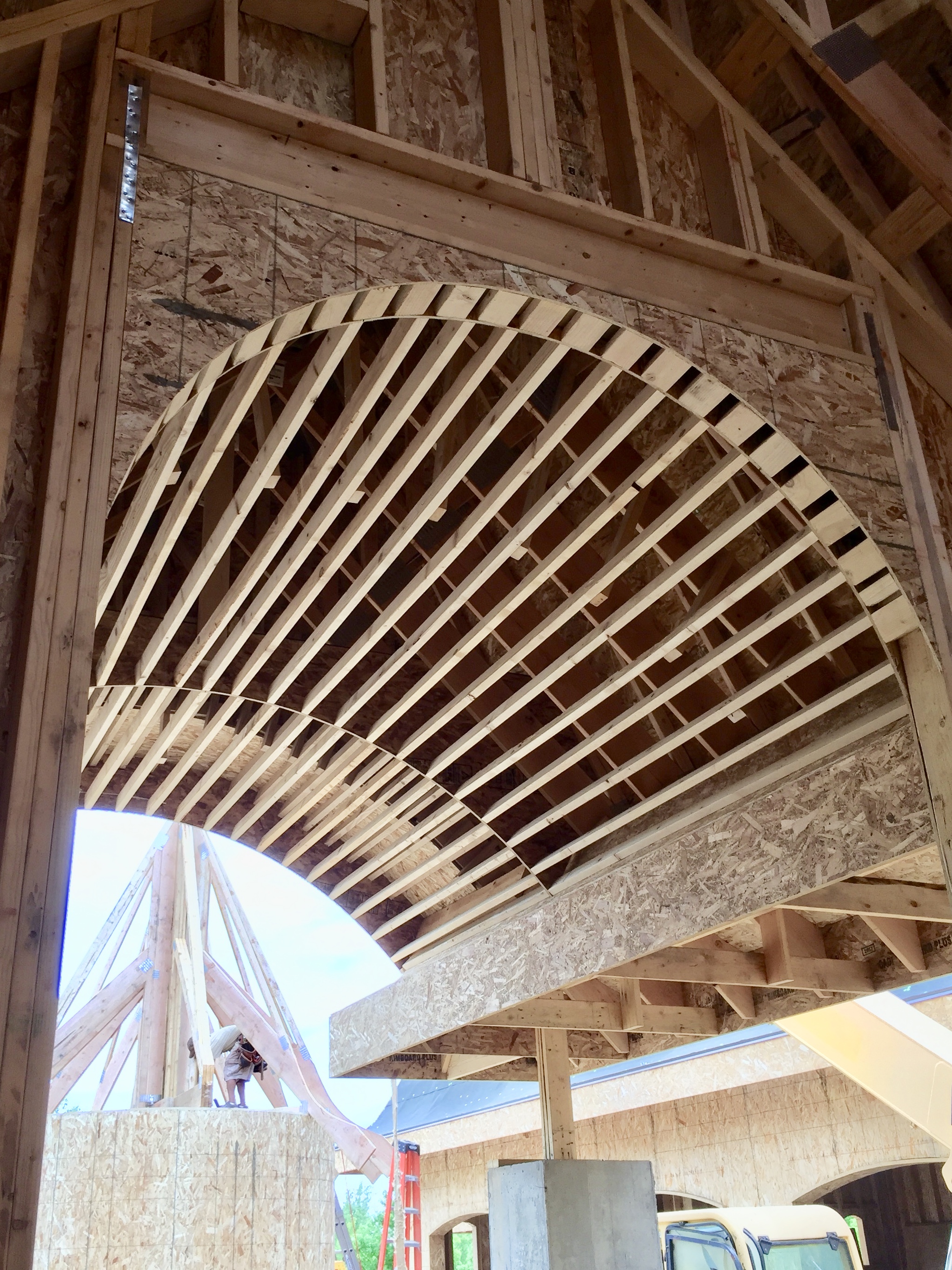
The perfectly curved walls are nothing short of beautiful in our opinion! This extra-large turret was built on a platform in front of the home as "bending" the wood is a more complicated type of framework. The hours spent getting it just right was well worth the effort!

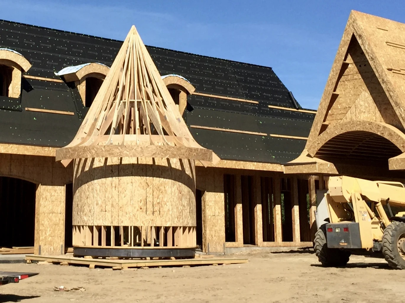
Moving day! Now with a roof, the turret is ready to be placed. A handful of workers spent several hours carefully moving the bulky framed piece, finishing just before sundown . . .

We had just enough time to take a shot before the light disappeared altogether. It turned out just as we had imagined—if not better—and looks perfect nestled in next to the grand front entrance.

And, if you were wondering, this is what the turret looks like from the inside! All that framework and the time and effort that was put into it really takes our breath away.

And finally, here's a first look at the front elevation of this fabulous home. It really is a gorgeous and unique project that we are so happy to be working on. As we've said before, we really do have the best clients in the world!
Spring Tablescapes
Spring is in full swing and we can't wait to share some of our favorite tablescapes for Easter! We are currently loving the idea of "less is more," and have found some simple yet elegant options that would be easy to recreate. If you are getting ready for a big Easter celebration this weekend or any fun family event this spring, we hope you find some inspiration here!

Photo courtesy Small Wood Home
Hydrangeas are always our favorite, and this darling tablescape from Small Wood Home really caught our eye. You can never go wrong with fresh flowers as a centerpiece, and the layered blue and white dishes topped with a sweet porcelain bunny are perfect for spring!

Photo courtesy Setting for Four
Pink is always prominent in the spring, and we love this combination of blue glass with pink blooms. This simple centerpiece really adds a pop of color against the soft white table runner and place mats. And not to be overlooked are the fabulous speckled paper mache eggs, which we think add the perfect touch!

Photo courtesy Jenny Steffens
Colorful farm fresh eggs have a dual purpose here and create a beautiful Easter centerpiece paired with some of the happiest daffodils we've ever seen. We love the simple white linens topped with a single flower and the simplicity of each table setting.

Photo courtesy On Sutton Place
You all know we've been loving blue, and this pretty place setting is no exception. The woven charger is the perfect base to the blue and white dishes, and the blue linen tied with a fun decorative tag creates just the right look for a simple Easter table.

Photo courtesy Julie Blanner
Keeping everything neutral is never a bad thing, but for spring adding a pop of color is always nice! This single cherry blossom is sweet and simple, and it looks absolutely darling in this classic porcelain egg cup, adding just the right hint of pink.

Photo courtesy Boxwood Clippings
And finally, these little birds' nests are always fun, and filling them with chocolate eggs make them the perfect spring detail that doubles as a sweet treat.
Now, to wrap things up, our best suggestion when it comes to putting together your spring tablescapes is to take advantage of all things fresh. When using fresh flowers, grasses, sprigs, and branches, you can never go wrong!
On Trend with Jewel Tones
If you haven't yet heard, jewel tones are the big thing for 2018 when it comes to interior design and décor. Jewel tones are deep and rich, typically with a high level of color saturation, and closely resemble your favorite precious or semi-precious gemstones. They are distinctive and stunning!
We are currently in love with jewel tones, and we are guessing you are too! For fun, we thought we'd share a few of our favorite looks when it comes to these sumptuous colors!

Image courtesy Architectural Digest
Earlier this year, Pantone named Ultra Violet as 2018's "Color of the Year." This luxurious purple is the perfect example of the jewel tones we've been talking about! Whether you want to paint your walls or add a splash of color with a fun piece of furniture, this is an amazing option.

Photo courtesy Sherwin Williams
And while we are talking color of the year, we might as well mention Sherwin Williams' choice for 2018 as well. This beautiful blue-green shade is called Oceanside, and it's fabulous! We love how warm it makes a room feel when paired with gold accessories and white accents.

Photo courtesy Greige Design
Who doesn't love a red door? This was too cute not to share. We love this ruby-toned pop of color! While this is so fun on a front door, we love the idea doing red on an interior door too!

Photo courtesy The French Bedroom Company
And finally, let's talk emerald! This deep green is so vibrant and looks fabulous paired with crisp white bedding and offers the perfect splash of color. Not to mention, the fabulous blanket is velvet, so this whole room is a win-win in our books!
Now, what colors do you picture when you hear the phrase jewel tones? What ones are your favorites? We'd love to hear in the comments below . . .
French Revival Project: Starting to Take Shape
Our last French Revival Project post left off with the first wall being placed, so this week we thought we'd share more of the framework going up and how this fabulous home really started taking shape.

More walls going in and rooms being created! Notice the columns ready and waiting to do their job? While we travel to the building site often to check on the progress, we are always amazed and excited about each new bit of framework that totally defines what was once an empty space.

One of our favorite architectural elements include these majestic high peaks, solid square columns, and what will eventually be a custom-made double iron door. The front entrance of this dreamy French home will be nothing short of grand.

These massive beams were artistically created by the homeowner and then incorporated into the design of our French Revival Project. They are both bold and beautiful, and they make the perfect statement in this soon-to-be gorgeous and spacious gathering place.

And finally, the extra large garage is now fully framed and looking fabulous! The dramatic roof-line and curved dormers offer the perfect aesthetic view. Additionally, the arched garage entrances add just enough charm to keep it all balanced and interesting.
Next week we'll share some of the fun and unique details that will be part of French Revival, so don't forget to check back soon!
Kitchens: White or Warm?
I think we can all agree that the kitchen is one of the most important rooms in the house. And whether it's time for a total kitchen re-do or you are starting from scratch, picking a style is crucial! We always ask our fabulous clients what they picture when it comes to the perfect kitchen, and, just as you might have imagined, everyone's answer is different!
There are so many amazing options and details that allow you to make your kitchen really feel like your own. While we try to help guide you making some of the big decisions, we want you to love your kitchen when all is said and done.
So, just for fun, if you were to pick out a dream kitchen right this very minute, what would you choose? Would you lean more toward the ever classic yet trendy white kitchen, or do you want a little more warmth and color? We've put together a few of our favorite looks below, so tell us what you decide!

We love how this traditional white kitchen from Martha O'Hara Interiors feels so bright and cheery. And to top it off, we just can't get over the gorgeousness of the island pendants, as well as the beautiful cabinets and the fun crisscross detail and glass on the doors. So dreamy!
If white just feels to stark to you, we suggest considering a subtle French gray like these amazing cabinets from Heidi Piron. The soft color still provides a bright space in your home, and offers a little more depth than classic white cabinetry. And these brass pulls are to do die for, we might add!
If you are feeling bold but still want to keep things neutral, a deep navy may be what you are looking for. Navy is definitely the "new" (or has it always been?) neutral. These Kitchen Craft cabinets happen to be paired with the perfect backsplash and appliances, making the space feel balanced and inviting.

If you are trying to keep things neutral, another beautiful option is taupe or beige! The softness of these beautiful, warm-colored cabinets featured on Style Me Pretty brings in a touch of elegance, and will remain timeless. over the years.

And finally, what is more warm than this amazing space from House and Home? These walnut cabinets are just stunning and instantly make you feel right at home.
We can't decide which option is our favorite. Can you?
French Revival Project: The Beginning
We've been working on an amazing project for quite some time now, and we are beyond thrilled to start sharing all of the fun details! It makes the most sense to start from the very beginning with how the project came to be and the driving forces behind it. With that being said, here is our "French Revival" in all its glory:
Nearly 2 years ago, our great friends and amazing clients approached us with what can only be described as a French architectural dream. Working with them and their fabulous architect Mike Upwall of Salt Lake City, UT has been both rewarding and fun. While we could go on and on (and on!) about how lovely this whole project has been, we think the pictures do a pretty great job telling the story.
Now, let's start from the beginning . . .

As with any home, a hole was dug and footings poured. At this point, the columns then began to take shape. The column supports were done very early in the process which was necessary structurally.

Another great shot and even more columns going in. (And all of them will be absolutely gorgeous!)

Once the columns were in place, framing could commence. With the first walls up, the French Revival Project really started to feel like a reality!

And finally, just a sneak peak at one of the hundreds of beautiful details that will make this home truly magnificent. The soft curved walls and stately turrets (that you'll get to see soon!) really just take our breath away!
Next week we'll share more of our favorite pictures and the next stages for this fun project, so make sure to stop by!
Bring in the Blue
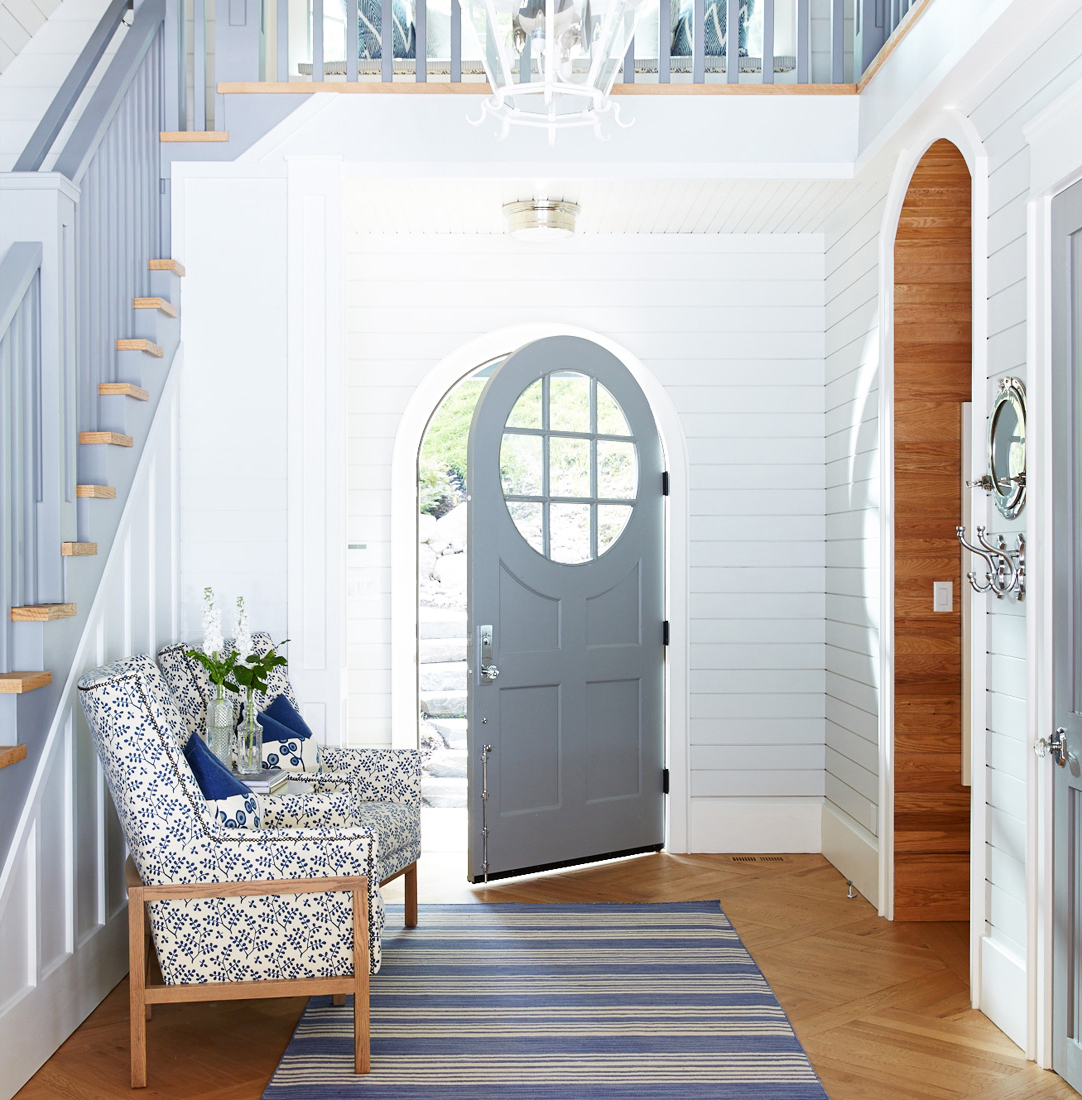
When you need a change in scenery at home or in the office, we have one great suggestion: bring in the blue! We can't get enough of blue and its many variations, and we just love how the right shade can brighten any room yet still feel neutral.
Whether you want blue walls or simply want to add some pops of blue with accessories and fun accents is totally up to you. We love it all and are excited to share some of our favorite uses of blue in order to help you figure out what it is you really want!

This fun buffalo check throw from Nantucket Looms adds a pop of blue to this beautiful living room without feeling overwhelming. Blues are always complementary when paired with other cool tones.
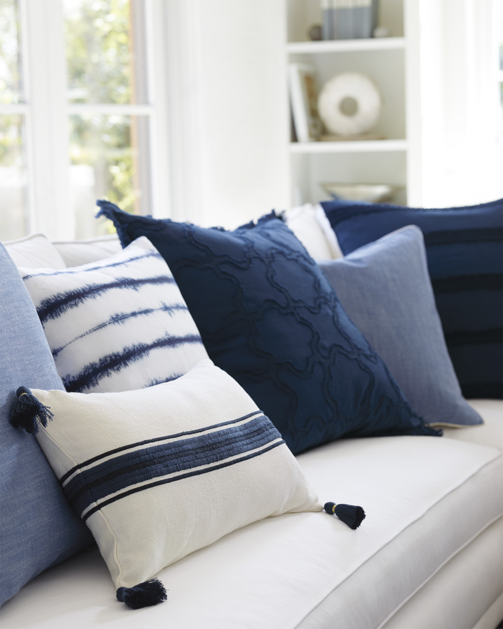
Blue pillows are such an easy way to add color to any space! This darling tassle pillow from Serena & Lily adds so much character to what would otherwise be a very plain and somber sofa.
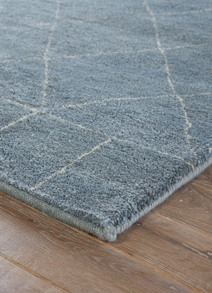
For an instant change in the look and feel of a room, try adding a blue rug! This Ashley Blue rug from Jaipur is one of our favorites as it adds a sense of beauty and warmth in an effortless way.
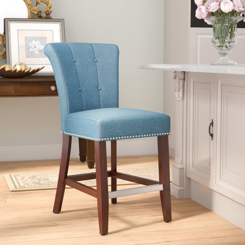
In a neutral kitchen, blue bar stools add the perfect pop of color! These bright blue upholstered stools from Wayfair are trendy, stylish, and easy to love.
Painting definitely makes updating the interior of your home a little more of a "process," so we suggest starting small. Painting a blue door like this beauty from Canadian Log Homes, is unbelievably refreshing and definitely feels less daunting than painting an entire room. However . . .

If you are in the painting mood, there are soft, subtle blues like Sherwin Williams Sleepy Blue that immediately offers a soothing feeling upon entering the room. Or if you want a rich, dark blue, we love the look of Sherwin Williams Naval.
So many choices, and so many beautiful options when it comes to blue!

Hello! Welcome to the Oviatt Design blog! We love every aspect of design and are so excited to share what inspires us. Finding a design you will truly love is both exciting and overwhelming at times, but it's our goal to help you feel happy and confident in your design choices while creating your own personal haven at home. Finding the perfect balance between style and comfort is possible, and when you have the best clients in the world like we do, it makes our job pretty easy getting there!